Design Vocabulary of Compass Offices Yaesu Central
Compass Offices’ newest location in Tokyo is situated in the “Yaesu Daibiru,” a landmark building with a history spanning a century. This landmark structure first opened its historical chapter in 1923 and is set to be reborn in 2025.
In this building that blends historical depth with a futuristic outlook, the challenge faced by the Compass Offices design team was: how to maintain the brand’s consistent DNA of efficiency and professionalism while injecting Japan’s unique sense of refinement and warmth?
The following is a layer-by-layer breakdown of the unique design vocabulary of this new center, seen through the designer’s perspective, revealing the brilliant dialogue between “Wabi-Sabi” (Harmony, Respect, Purity, Tranquility) and “Modern Business.”
1. Overall Style: A Warm Balance of Modern Simplicity and “Resimercial”
Upon entering the center, the first thing one feels is the space’s perfect interpretation of the current cutting-edge design trend, “Resimercial” (Residential + Commercial). The design team broke the cold, rigid stereotype of traditional business centers, yet without losing a sense of professionalism due to excessive domestication, precisely balancing the two.
In the spacious public areas, the designers made extensive use of light-colored Herringbone wood flooring. This classic laying method not only retains the high-end feel of European design but its warm, wood-grain texture also aligns perfectly with the Japanese culture’s reverence for “wood,” setting a warm, transparent, and inclusive tone for the entire space.
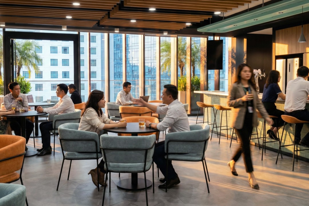
2. Color Philosophy: A Shift from “Corporate Blue” to “Earth Tones”
Unlike traditional business centers that often use cool tones like tech blue, gray, and white to emphasize rationality, the Yaesu Central presents a set of Earth Tones that are highly characteristic of contemporary Japanese aesthetics, making this one of the center’s most notable features:
- Matcha & Olive: The dining chairs and throw pillows in the lounge area are chosen in varying shades of green. This is not only an echo of the natural environment but also introduces a sense of tranquility, akin to a Japanese garden, indoors.
- Terracotta & Warm Orange: The niche seating areas boldly use warm orange acoustic panels. This visually creates a distinct focal point, injecting vitality into the space without being harsh.
- Stone Grey and Natural Wood Color: Large expanses of light wood grain and the stone texture of the reception counter balance the above colors, ensuring the space remains business-appropriate and stable while lively.
This sophisticated color strategy aims to allow users, amidst a fast-paced and tense work rhythm, to feel emotional relief and release through the guidance of visual colors.
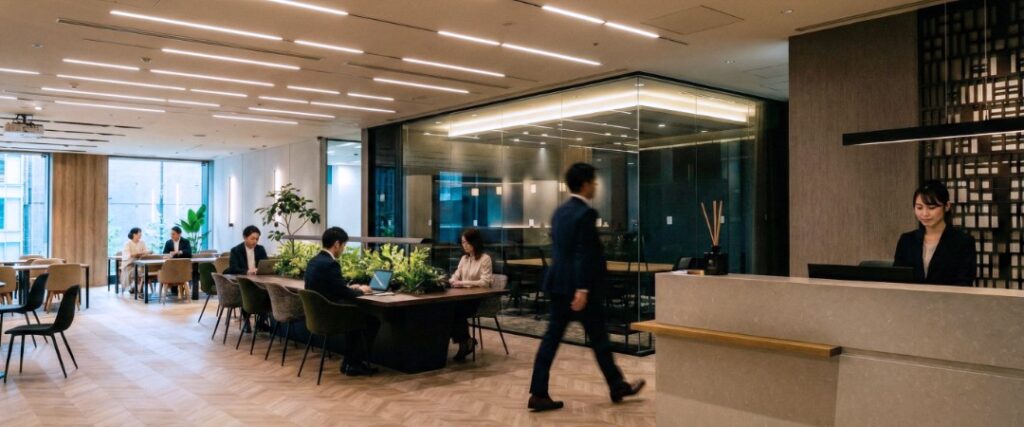
3. Modern Interpretation of Eastern Imagery: The “Japanese Style” in Details
The soul of design is often hidden in the details. In the design of the Reception area, the background wall features a dark grille design. This is clearly a tribute to the traditional Japanese architectural element—“Kumiko” or “Shoji” (grille or screen).
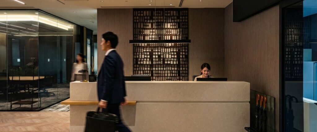
The designers did not merely copy the traditional style but simplified it into modern geometric lines, paired with the minimalist horizontal lines of the counter in front, presenting a sense of order filled with “Zen.” This fusion of old and new allows visitors to subconsciously feel “This is in Japan” upon entry, experiencing a deep connection between an international workspace and local culture.
4. Light and Shadow Design: The Space’s Invisible Guide
Lighting in this project is more than just illumination; it plays the role of an “invisible guide,” setting the pace of the space:
- Rational Guidance | Linear Lighting: A large number of parallel linear LED light strips on the ceiling echo the building’s 2,900mm high ceiling advantage. This not only provides uniform and sufficient basic lighting but also creates a strong visual orientation, guiding users’ sightlines and flow, increasing the sense of depth in the space.
- Emotional Ambiance | Key Accents: In the pantry and lounge areas, designers used warm-colored pendant lights and shelf lights for mood conversion. The carefully selected glass pendant lights in the bar area, in particular, add a touch of subtle luxury, allowing people to shift their mindset during a coffee break and enjoy a moment of respite.
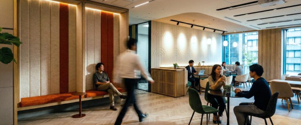
5. Biophilic Design: The Breathing Collaborative Space
Echoing the Yaesu Daibiru’s design, which demonstrates a commitment to the environment and has achieved multiple leading ESG certifications, Compass Offices extended this concept of sustainable development into the interior design, showcasing Biophilic Design to its fullest.
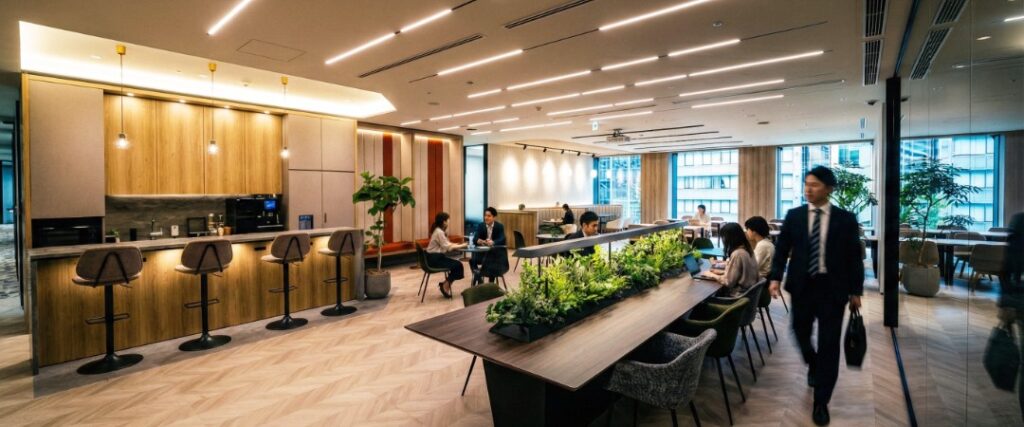
The Communal Table in the open collaboration area is a highlight of the space. The designers embedded a lush green plant trough in the center of the table body. This is not merely decorative but serves a dual function:
- Psychological Partition: The plants create a natural visual buffer between people working face-to-face, preserving privacy and a sense of security within the open setting.
- Visual Noise Reduction: The vibrant green color effectively reduces visual fatigue.
Paired with large potted plants (such as the Fiddle-leaf Fig) scattered in the corners, the entire space resembles a miniature indoor garden in the city, reflecting Compass Offices’ high regard for the well-being of its guests.
Compass Offices Yaesu Central is more than just an office; it is an exhibition of design thinking. By preserving the century-old resilience of the Yaesu Daibiru and injecting soft Japanese aesthetics and humanized design indoors, we have created a business hub for enterprises that can connect with the world while also allowing the mind to rest.